# xui
**Repository Path**: twgh/xui
## Basic Information
- **Project Name**: xui
- **Description**: shadcn 风格的 xcgui 自绘组件, 快速开发美观的 Windows 桌面应用
- **Primary Language**: Go
- **License**: MIT
- **Default Branch**: main
- **Homepage**: None
- **GVP Project**: No
## Statistics
- **Stars**: 1
- **Forks**: 0
- **Created**: 2026-10-19
- **Last Updated**: 2026-11-07
## Categories & Tags
**Categories**: Uncategorized
**Tags**: shadcn-ui, xcgui, Go语言, Windows
## README
# xui — shadcn 风格的 xcgui 自绘组件


## 介绍
为 [github.com/twgh/xcgui](https://github.com/twgh/xcgui) (炫彩界面库)提供一套 **shadcn-ui 风格**的自绘组件: 主题令牌、变体系统、copy-not-install 分发。
```
┌─────────────────────────────────────────────┐
│ 你的应用 │
│ ┌───────────────────────────────────────┐ │
│ │ ui/ ← 组件源码归你所有, 随意修改 │ │
│ │ button.go checkbox.go input.go … │ │
│ │ theme.go ← 你的主题, 改这里换肤 │ │
│ └───────────────────────────────────────┘ │
│ ↑ 依赖 ↑ 拷贝 │
│ github.com/twgh/xui (运行时) xui CLI │
│ ↑ │
│ github.com/twgh/xcgui (行为层) │
└─────────────────────────────────────────────┘
```
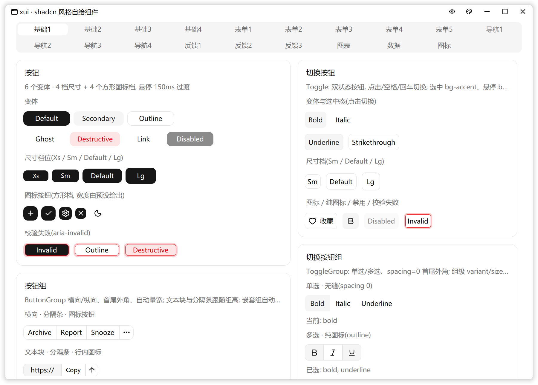
### 示例图
## 快速开始
### 直接运行示例(想先看效果)
不想先建项目时, 可以直接运行仓库里的 demo(全部组件 + 主题切换):
```bash
go run github.com/twgh/xui/demo@latest
```
### 新建项目(推荐)
先装一次 CLI (之后直接敲 `xui`; 安装位置与 PATH 见下方 [CLI](#cli) 章节):
```bash
go install github.com/twgh/xui/cmd/xui@latest
xui init -n myapp
cd myapp
go run .
```
`-n` 会创建一个默认的项目, 目录已存在且非空时需加 `-f/--force`。
### 已有项目
在项目根目录执行。组件目录默认 ui/, 想换名字: xui init components (或 -p components)
```bash
xui init
```
### 示例源码
```go
package main
import (
"github.com/twgh/xcgui/app"
ui "yourmodule/ui" // 换成你的模块路径
)
func main() {
app.InitOrExit()
a := app.New(true) // Direct2D 渲染
a.EnableAutoDPI(true).EnableDPI(true) // 跟随系统 DPI
a.SetPaintFrequency(10) // hover 过渡 ~60fps
// 窗口: 圆角阴影 + 自绘标题栏(最小化/最大化/关闭) + 主题化底色, 全部默认配好
w := ui.NewAppWindow("我的应用", 640, 480)
content := w.Content()
content.SetPadding(24, 20, 24, 24) // 内容区留白
ui.NewButton(0, 0, 0, 0, "确定", content.Handle)
ui.NewCheckbox(0, 0, 0, 0, "记住我", content.Handle)
ui.NewInput(0, 0, 0, 0, content.Handle, ui.WithPlaceholder("用户名"))
w.Show(true)
a.Run()
a.Exit()
}
```
标题栏要加自己的按钮(如切换主题)用 `w.AddCaptionButton(icons.IconMoon, func() { ... })`,
排在最小化按钮左边; 内容组件纵向排列, 间距由内容容器的 `SetSpace` 控制。
## 换肤
组件在**绘制时**实时读取主题令牌(等价于 CSS 变量), 切换主题零成本:
```go
xui.SetTheme(xui.Dark()) // 一行全局换肤
```
主题文件 `ui/theme.go` 默认是**内置主题的副本**(逐字段改即可换肤), 也可以照 shadcn 的
`:root` / `.dark` 自己写一份 —— 令牌与 CSS 变量一一对应(字段表见 DESIGN.md 3.1)。
想运行时换"主题色"时, 克隆当前主题并只替换主色组即可(不必重建窗口, 下一帧全窗口自动用新色):
```go
t := *xui.Light() // 暗色用 *xui.Dark()
t.Primary = xui.Hex("#2563eb")
t.PrimaryForeground = xui.Hex("#fafafa")
t.Ring = t.Primary // 焦点环
t.SidebarPrimary = t.Primary // 侧边栏主色(如用 Sidebar)
t.SidebarPrimaryForeground = t.PrimaryForeground
xui.SetTheme(&t)
```
demo 的标题栏调色板与「基础1 → 主题色」卡片演示了这套做法(`go run github.com/twgh/xui/demo@latest` 可直接跑)。
## 组件
| 组件 | 说明 |
|---|---|
| Button | 6 变体(default/secondary/outline/ghost/destructive/link)× 8 尺寸档;图标按钮 / 图标+文字 / 内容对齐 / 胶囊 / 加载态;`cx` 传 0 按文字自动量宽 |
| ButtonGroup | 按钮组:横向/纵向、首尾外角 + 相邻边直角、宽高按内容自撑;可混放 Button / Input / ComboBox |
| Alert | 提示条:图标 + 标题 + 描述 + 右上动作槽;两变体(default/destructive),高度按内容自撑、文字自动折行 |
| Empty | 空状态容器:图标底板 + 标题 + 描述 + 动作区;三个槽位 `Header()` / `Content()` / `Body()`,不画边框 |
| Field | 表单字段布局:Label / Title / Description / Content / 校验错误区,垂直或水平取向;横向时内容默认 240 宽(嵌套布局只认 Fixed 宽) |
| Item | 列表项:媒体 + 内容 + 动作区 + 头/尾槽位,三变体两尺寸;配 ItemGroup / ItemSeparator / ItemTitle / ItemDescription |
| Breadcrumb | 面包屑:链接(hover 过渡 + `OnClick`)/ 当前页 / 分隔符 / 省略号 |
| Kbd | 键帽:宽度按文字自适应;`NewKbdGroup` 排组合键 |
| Skeleton | 骨架屏:主题圆角 + 2s 脉冲;`WithSkeletonCircle` 做头像占位 |
| Spinner | 加载指示器:图标 1s/圈旋转,尺寸/配色可调 |
| Toggle / ToggleGroup | 双状态按钮与按钮组:default / outline 两变体、三档尺寸;鼠标/空格/回车切换;单选组默认互斥且可全部取消,`spacing=0` 做成分段控件 |
| NativeSelect | 原生下拉框:`